


Equity, Social Justice, and Inclusion
Penn GSE has long been committed to preparing our students to live, work, and lead in a world marked by sweeping demographic change and interconnectedness.
You can use these global components on any general content page.
Your Component Library is a highly-modular design system built for rapid web page development. It contains different materials that can be assembled into more complex page layouts. Below are examples of your general component library, prefaced by usage guidelines and content strategy.
if you'd like to go "under the hood," view back end field structure of each component displayed here.
See Special Use General Components for descriptions of components reserved for special areas of the site.
A vertically stacked list of headers that can be clicked to expand and reveal content.
We designed this program for working professionals, including:
It is an intensive, cohort-based program that brings together a professional learning community.
Spanning over 36 months, the program meets on campus for one long weekend each month and one week each summer, as well as holding online interactions via collaborative, interactive platforms.
With the dissertation process and significant support embedded in the schedule, you are able to complete your coursework and dissertation within 3 years.
Please note these dates are subject to change. A finalized schedule will be given during orientation.
“Libraries are vital community spaces! I'm setting out to make every family in West Philadelphia feel welcome in their local library.”
A flexible component to introduce related information visually and with text and invite visitors to learn more by linking to other pages.
We offer three residency programs for aspiring teachers or for current teachers looking to achieve state certification or growth in their areas of expertise. TEST
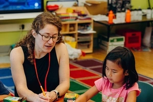
Earn initial Pre-K-12 certification in 10 months while apprenticing in an experienced teacher’s classroom in a wide range of schools in Philadelphia.

Earn Pre-K-12 certification in 2 years while working as a teacher, teacher’s aide, or Teach for America Corps member in an urban school in Philadelphia.
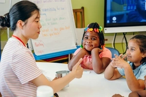
Become a teacher for grades 7-12 in an independent day or boarding school in a program that combines a 2-year, school-based fellowship with weekend and summer classes
We offer three residency programs for aspiring teachers or for current teachers looking to achieve state certification or growth in their areas of expertise.
arn initial Pre-K-12 certification in 10 months while apprenticing in an experienced teacher’s classroom in a wide range of schools in Philadelphia.
Earn Pre-K-12 certification in 2 years while working as a teacher, teacher’s aide, or Teach for America Corps member in an urban school in Philadelphia.

Become a teacher for grades 7-12 in an independent day or boarding school in a program that combines a 2-year, school-based fellowship with weekend and summer classes.
Gain extensive hands-on experience in becoming a Teacher of English to Speakers of Other Languages (TESOL) in Philadelphia-area community settings and schools.
We offer three residency programs for aspiring teachers or for current teachers looking to achieve state certification or growth in their areas of expertise.

10 months to certification
Earn initial Pre-K-12 certification in 10 months while apprenticing in an experienced teacher’s classroom in a wide range of schools in Philadelphia.
Several teaching roles in a Philadelphia urban school
Earn Pre-K-12 certification in 2 years while working as a teacher, teacher’s aide, or Teach for America Corps member in an urban school in Philadelphia.
Experience teaching at a full-year school
Become a teacher for grades 7-12 in an independent day or boarding school in a program that combines a 2-year, school-based fellowship with weekend and summer classes.
Gain extensive hands-on experience in becoming a Teacher of English to Speakers of Other Languages (TESOL) in Philadelphia-area community settings and schools.
We offer three residency programs for aspiring teachers or for current teachers looking to achieve state certification or growth in their areas of expertise.
Several teaching roles in a Philadelphia urban school
Earn Pre-K-12 certification in 2 years while working as a teacher, teacher’s aide, or Teach for America Corps member in an urban school in Philadelphia.
Experience teaching at a full-year school
Become a teacher for grades 7-12 in an independent day or boarding school in a program that combines a 2-year, school-based fellowship with weekend and summer classes.
Gain extensive hands-on experience in becoming a Teacher of English to Speakers of Other Languages (TESOL) in Philadelphia-area community settings and schools.
Gain extensive hands-on experience in becoming a Teacher of English to Speakers of Other Languages (TESOL) in Philadelphia-area community settings and schools.
A simple, manually created contact card.
Let's work together to improve the educational, professional, and social-emotional outcomes for all members of Philadelphia school communities


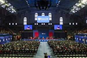
Intention, Optimization, and Excellence in Graduate School
Time: 2:00 PM - 3:00 PM EDT | Location: Online
Time: 5:00 PM - 5:30 PM EDT | Location: Online
Time: 12:00 PM - 1:00 PM EDT | Location: Online
(Default display is compact, with a carousel)
(Books data is next to the book image, and the book items stack. No carousel.)
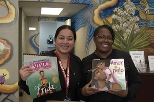
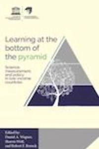
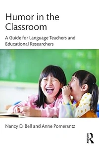
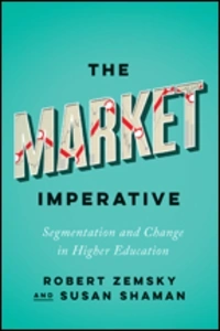
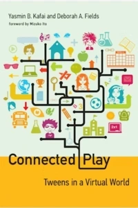
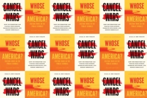
Our higher education faculty continue to make their research accessible to the practitioners who need it the most. Check out some of their books on the future of higher education.

Learn from professors who understand the connection between research and real-world experience, and appreciate the distance between ideas and implementation. While housed in the University of Pennsylvania's Graduate School of Education, the Penn Chief Learning Officer program draws from senior faculty across many of Penn's world-class graduate schools. The program also brings in a small number of leading experts from outside the university, including distinguished alumni.
In addition to Penn GSE faculty, our program invites distinguished alumni and friends who have run successful educational policy startups.
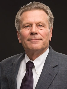
Katie Riemers
President, Better Educational Solutions
Lead Archivist, Campaign for Progressive Educational Policy

Jory McMahan
Principal, McMahan Group
A compact and attractive way to group links to other pages, to aid wayfinding.
Be sure to follow best practices when naming files, using alt text, and creating transcripts. WCAG 2.1 guidelines require the inclusion of descriptive alt text for images and transcripts for videos. When captioning videos, write descriptions that summarize the most compelling and important points contained within the video to encourage users to view the item.
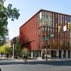
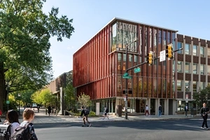
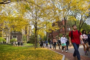
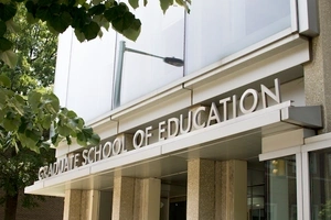
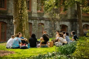
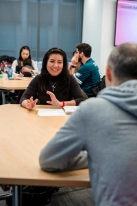
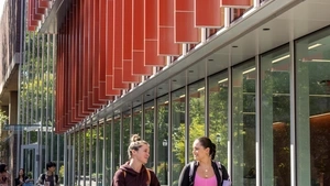
At Penn GSE, your academic development is framed by the places you go, and the people you meet. You'll grow as an eduacator on a beautiful campus and in buildings well-equipped for the exchange of ideas.


Day and evening, our Penn GSE building is a welcoming place.


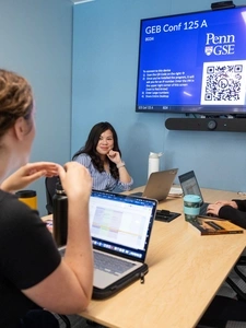
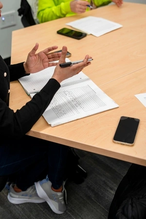
You'll find spaces to collaborate all over the building.
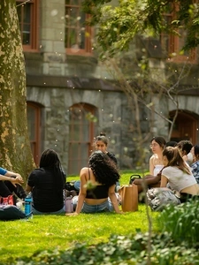
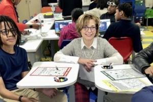
Our students gain insight with deep discussions, inside and outside the classroom.

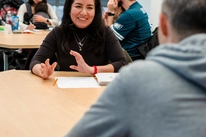
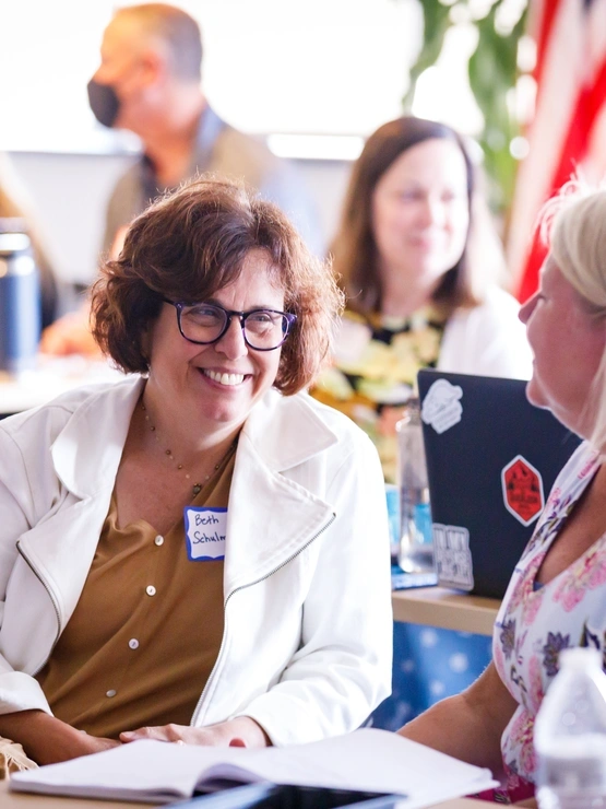
A person-centered, full-width, interactive component that highlights a success story in the context of Penn GSE's values and brand.
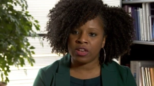
Sundai Riggins is Principal of Hendley Elementary School in the District of Columbia Public Schools. She thinks she wouldn't be where she is today without the support of her cohort.
Sundai Riggins
Read about where we build partnerships, work within communities, reach out across our city, and make a difference in millions of lives.
A graduate degree from Penn GSE opens up whole new worlds, intellectually as well as professionally. If you are a passionate, innovative, impactful leader—or aspire to be one—Penn GSE is the place for you.
1200+ Master’s Degree students
5:1 Student: Faculty ratio
50+ Penn GSE Alumni are serving as college presidents
95 Number of countries where Penn GSE alumni work
1 Million+ Learners are impacted by the Penn GSE community each year
109 Years of educating educators
Penn GSE has long been committed to preparing our students to live, work, and lead in a world marked by sweeping demographic change and interconnectedness.
Lorem ipsum dolor sit amet, consectetur adipiscing elit, sed do eiusmod tempor incididunt ut labore et dolore magna aliqua. Ut enim ad minim veniam.

Lorem ipsum dolor sit amet, consectetur adipiscing elit, sed do eiusmod tempor incididunt ut labore et dolore magna aliqua. Ut enim ad minim veniam.

Lorem ipsum dolor sit amet, consectetur adipiscing elit, sed do eiusmod tempor incididunt ut labore et dolore magna aliqua. Ut enim ad minim veniam.

Penn GSE has long been committed to preparing our students to live, work, and lead in a world marked by sweeping demographic change and interconnectedness.
Lorem ipsum dolor sit amet, consectetur adipiscing elit, sed do eiusmod tempor incididunt ut labore et dolore magna aliqua. Ut enim ad minim veniam.
Lorem ipsum dolor sit amet, consectetur adipiscing elit, sed do eiusmod tempor incididunt ut labore et dolore magna aliqua. Ut enim ad minim veniam.
Lorem ipsum dolor sit amet, consectetur adipiscing elit, sed do eiusmod tempor incididunt ut labore et dolore magna aliqua. Ut enim ad minim veniam.

Libraries are vital community spaces! I’m setting out to make every family in West Philadelphia feel welcome in their local library.

We do what we do because we believe in the incredible power that education can have to serve the greater good and address society’s challenges. Here are three ways we put our values into action.
Our location is an important part of our story. Not only because Philadelphia is full of opportunities to put our work into action, but because it’s the beginning of a global network of classrooms, schools, communities and other places where our students and alumni are making change.
Penn GSE is a pioneer in innovation and entrepreneurship in education. We are passionate about developing new approaches to pressing problems in education and shaping the future of education across preK–12, higher education, and learning for working professionals.
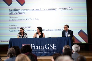
In today’s dynamic educational landscape, leaders are confronted with unparalleled challenges. Whether you're navigating complex politics, improving student retention rates, or cultivating a thriving workforce, the demand for expert guidance and evidence-based solutions has never been more pressing. Penn GSE is preparing leaders to meet today’s and future challenges.

Learn what you need now, build your network and make a bigger impact.
An acronym for “what you see is what you get”, a WYSIWYG editor is a component that allows you to populate, edit, and format content in a form closely resembling the final layout of the rendered text. It has a number of built-in markup options and a familiar interface—allowing for significant flexibility. The WYSIWYG editor is capable of styling many different elements.
The WYSIWYG Block is often the first building block in the content region of a page, but it doesn’t have to be. It’s possible to have more than one WYSIWYG block per page which makes it possible to break up long texts into two or more content areas with other more visual building blocks in between. A varied content layout is easier for your readers to scan and parse.
Be careful when pasting content from other word processors. The resulting text can be formatted in unexpected ways. If you do paste in from outside, always use a paste as text keyboard shortcut.
To ensure you are creating accessible content when formatting text in the WYSIWYG Block, be sure to follow WCAG headline use guidelines. Follow best practices when naming files, using alt text, and creating transcripts. WCAG 2.0 guidelines require the inclusion of descriptive alt text for images that are not merely decorative. Refer to the W3C alt Decision Tree, when writing alt text. The decision tree is also linked to in every image’s Details panel.
Video captions are also required. When captioning videos, write descriptions that summarize the most compelling and important points contained within the video to encourage users to view the item.
Headings 2-6 help break up the page into logical priority and hierarchy. As such, they should always follow a sequence. Heading 1 is designated for the page title and appears at the top of each page. Heading 2 and below are to be used for organizing body copy. Use background shading for visual appeal and to break up larger WYSIWYG sections.
Hyperlinks can be added to words or phrases for when you need to link out to something within paragraph text, such as our faculty, or interest areas. We recommend that all links open in the same tab, even links to external sites. This is current best practice, for accessibility and usability reasons. If visitors want to open a hyperlink in a new tab, they can do that with a browser command.
Bulleted (Unordered) lists are great for breaking up long paragraphs that mention many items broken up by commas, or any time you have a number of equally important items within a particular category. Numbered (Ordered) lists are great for breaking up sequences of information in a process, such as application steps.
Tables can contain as many rows as you like, though you should limit the number of columns to 4. Though more will still work, they will horizontally scroll. Formatting tables is labor intensive, but you’ll find controls for them in the toolbar.
Both images and video can be included within the WYSIWYG, Many components use image and video, so the best time to choose an inline image or video is when it adds context to the written body copy around it. You can change the positioning of images in relation to text, and add or edit the caption from the Media Gallery before you insert it, or with popup controls after you insert it.
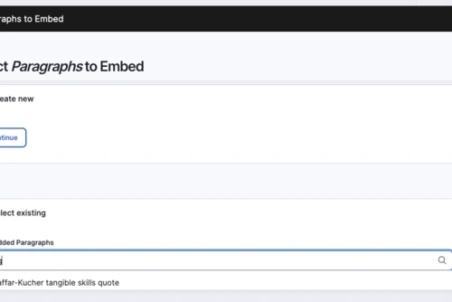
Create a new block quote to display, or insert one that another user has created, by choosing Select Existing, and finding the existing quote by keyword:
"I think tangible skills are really important and a cornerstone of our program."

“The constant exchange of ideas and the community of minds challenging and uplifting each other have been the most transformative aspects of these two years at Penn. I came for the education—but I’m leaving most grateful for the people.”
Lorea Peterson Redondo, dual-degree graduate student, M.B.A. and Education Policy, M.S.Ed.